# load the glbwarm data set
glbwarm <- read.csv("data/glbwarm.csv")Exploratory Data Analysis
Learning Goals
By the end of this section, you will gain an understanding of the following concepts, be familiar with the R functions required to calculate and create statistical measures and plots, and be able to interpret them:
Sample size and data set preview
Frequency distributions of a variable
Histograms, boxplots, and bar plots
Measures of central tendency and measures of spread
Standardization and z-scores
Sample size and data preview
Sample size and data preview are crucial first steps when working with a new data set. This involves describing the general characteristics of the data set, such as the number of cases (sample size), examining the types of variables, and calculating descriptive statistics like the mean and standard deviation. Including information on the data set and variables in a research report is standard practice.
To perform these operations, we can use the following functions in R:
dim()to find the number of rows in the data set, which corresponds to the number of cases (sample size) in a common and well-structured data set.str()orglimpse()(in thetidyversepackage) to examine the types of variables included in the data set.head()to preview the data set.View()to view the data set in a separate window (note: this function is not recommended for huge data sets, as it can freeze your computer).
For example, let’s use the global warming study data set (glbwarm).
The data set is well-organized. Each row represents a case, making it easy to calculate the sample size by counting the number of rows, which in this case is 815 (n = 815). The data set contains 7 variables. The variable types can be examined using the glimpse function.
dim(glbwarm)[1] 815 7library(tidyverse)── Attaching packages ─────────────────────────────────────── tidyverse 1.3.2 ──
✔ ggplot2 3.4.0 ✔ purrr 1.0.1
✔ tibble 3.1.8 ✔ dplyr 1.1.0
✔ tidyr 1.3.0 ✔ stringr 1.5.0
✔ readr 2.1.3 ✔ forcats 1.0.0
── Conflicts ────────────────────────────────────────── tidyverse_conflicts() ──
✖ dplyr::filter() masks stats::filter()
✖ dplyr::lag() masks stats::lag()glimpse(glbwarm)Rows: 815
Columns: 7
$ govact <dbl> 3.6, 5.0, 6.6, 1.0, 4.0, 7.0, 6.8, 5.6, 6.0, 2.6, 1.4, 5.6, 7…
$ posemot <dbl> 3.67, 2.00, 2.33, 5.00, 2.33, 1.00, 2.33, 4.00, 5.00, 5.00, 1…
$ negemot <dbl> 4.67, 2.33, 3.67, 5.00, 1.67, 6.00, 4.00, 5.33, 6.00, 2.00, 1…
$ ideology <int> 6, 2, 1, 1, 4, 3, 4, 5, 4, 7, 6, 4, 2, 4, 5, 2, 6, 4, 2, 4, 4…
$ age <int> 61, 55, 85, 59, 22, 34, 47, 65, 50, 60, 71, 60, 71, 59, 32, 3…
$ sex <int> 0, 0, 1, 0, 1, 0, 1, 1, 1, 1, 1, 0, 1, 0, 1, 1, 1, 0, 0, 0, 0…
$ partyid <int> 2, 1, 1, 1, 1, 2, 1, 1, 2, 3, 2, 1, 1, 1, 1, 1, 2, 3, 1, 3, 2…The head function also print a preview of the data set.
head(glbwarm) govact posemot negemot ideology age sex partyid
1 3.6 3.67 4.67 6 61 0 2
2 5.0 2.00 2.33 2 55 0 1
3 6.6 2.33 3.67 1 85 1 1
4 1.0 5.00 5.00 1 59 0 1
5 4.0 2.33 1.67 4 22 1 1
6 7.0 1.00 6.00 3 34 0 2Measure of central tendency
Descriptive statistics are used to summarize and describe the variables of a data set. Typically, there are two general types of statistics that are used to describe data: Measures of central tendency and Measures of spread.
Measures of central tendency include the mode, median, and mean, which is the most commonly used measure and is particularly useful in linear regression modeling:
Mode: the most frequent score in our data set;
Median: the middle score for a set of data that has been arranged in order of magnitude;
Mean: the sum of all the values in the data set divided by the number of values in the data set. The mean is essentially a model of the data set and has the property of minimizing error in the prediction of any value in the data set. In other words, the mean is the best predictor in the absence of better predictors.
A description of the different measures can be found in any statistics book as well as online, for instance, here.
The Mean
In R, the mean of a variable can be calculated using the function mean. For instance, the mean age of people in the sample can be calculated by the function mean(glbwarm$age), which returns 49.5362.
mean(glbwarm$age)[1] 49.5362If you wish to round off the number of decimals, the round function can be used, which takes two arguments - the number or function to be rounded off and the integer specifying the number of decimals. For example, round(mean(glbwarm$age), 2) returns 49.54, which can also be represented by creating an object (e.g., mean_age) to store the output of the function mean and then rounding it off.
round(mean(glbwarm$age), 2)[1] 49.54This is a shorter equivalent to creating an object mean_age representing the output of the function mean (i.e., the mean age) and then rounding it off.
mean_age <- mean(glbwarm$age)
round(mean_age, 2)
[1] 49.54Frequency distributions
The frequency distribution of a variable provides an overview of its values and how often they occur, also known as its frequency.
Variables can have either continuous or discrete distributions, depending on their type. The distribution of a variable is typically summarized using the five-number summary and visually represented using histograms and box plots (for continuous or discrete variables) or bar charts (for categorical variables).
Discrete variables only take on specific values and are therefore characterized by discrete distributions. Examples of such variables include count data, which consist of non-negative integers, such as the number of friends on Facebook. In the
glbwarmdata set, the variable “ideology” is measured on a discrete scale ranging from 1 to 7.Discrete variables can also represent categorical data, which express the qualitative dimensions of a phenomenon. For instance, city names (Vienna, London, Verona) or ordered categorical values (low, medium, high) can be used as categorical data. Although categorical data can be represented by numbers, they should not be treated as mathematical objects, but as “names” or ordered categories. Categorical variables that can take on only two values are called dichotomous variables. In the
glbwarmdata set, the variablesexis represented as a dichotomous variable.Continuous variables have infinite (uncountable) possible values and are therefore characterized by continuous distributions. Examples of continuous variables include temperature or velocity. In the
glbwarmdata set, the variablegovactis represented as a continuous variable.
Five-Number Summary
A numerical description of the distribution is provided by the function summary, which gives the five-number summary.
summary(glbwarm$ideology) Min. 1st Qu. Median Mean 3rd Qu. Max.
1.000 3.000 4.000 4.083 5.000 7.000 The five-number summary includes the mean, the median, minimum and maximum values, and the first and third quartiles. Quartiles are cut points that divide the range of values of the variable into four parts, or quarters, of more-or-less equal size (25%, 25%, 25%, 25%). The median is the value separating the lower 50% from the upper 50% of the distribution.
Box plots (box and whisker plot)
The same information as the five-number summary can be graphically displayed by a boxplot, also called a box-and-whisker plot. The “box” represents the 1st and 3rd quartiles, the central line is the median, and the “whiskers” represent the maximum and minimum values.
The points above and below the whiskers are outliers, which are data points that differ significantly from other observations. Since they are so different, they can be difficult to predict and can sometimes bias the estimates of linear regression models.
# use the argument "main" to add a title
boxplot(glbwarm$govact, main = "Ideology")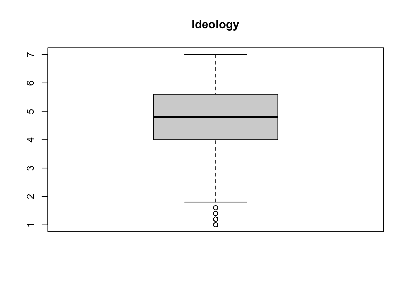
Histogram
Another way to display the distribution of a variable is by using a histogram, which can be created using the hist function.
The function can be used to show the frequency distribution of values and their probability distributions.
# use "main" tp change the title, and "xlab" to change the name of the x axis
hist(glbwarm$govact,
     main = "GOVACT (GLBWARM data set)", xlab = "govact")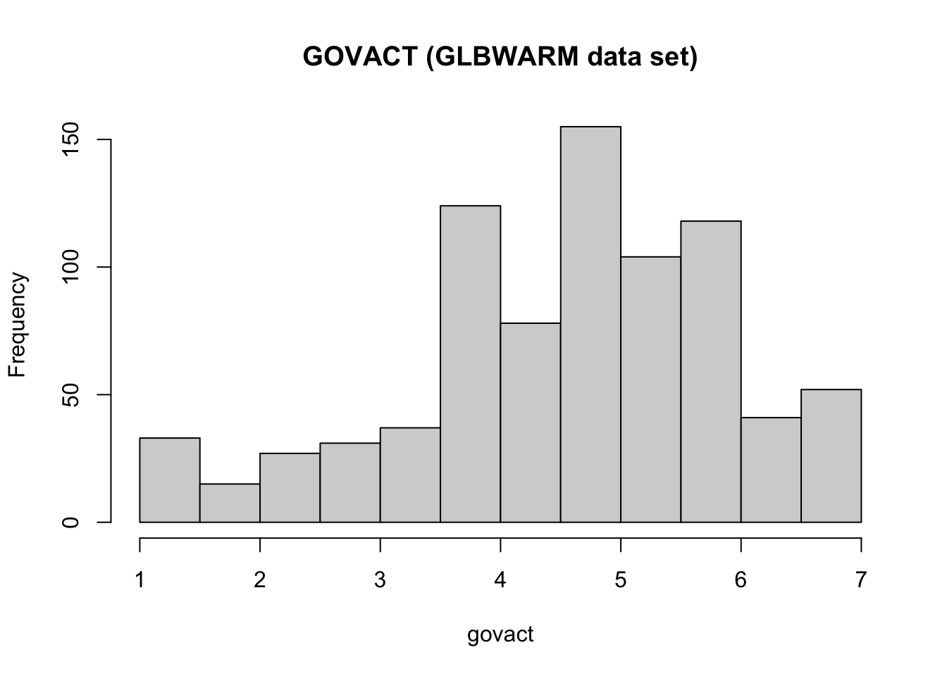
# you can use the argument "col" to change the color
# to see the available colors, run the following command in the console: colors()
hist(glbwarm$govact, probability = TRUE,
     main = "GOVACT (GLBWARM data set)", xlab = "govact",
     col = "slategrey")
lines(density(glbwarm$govact, adjust = 2))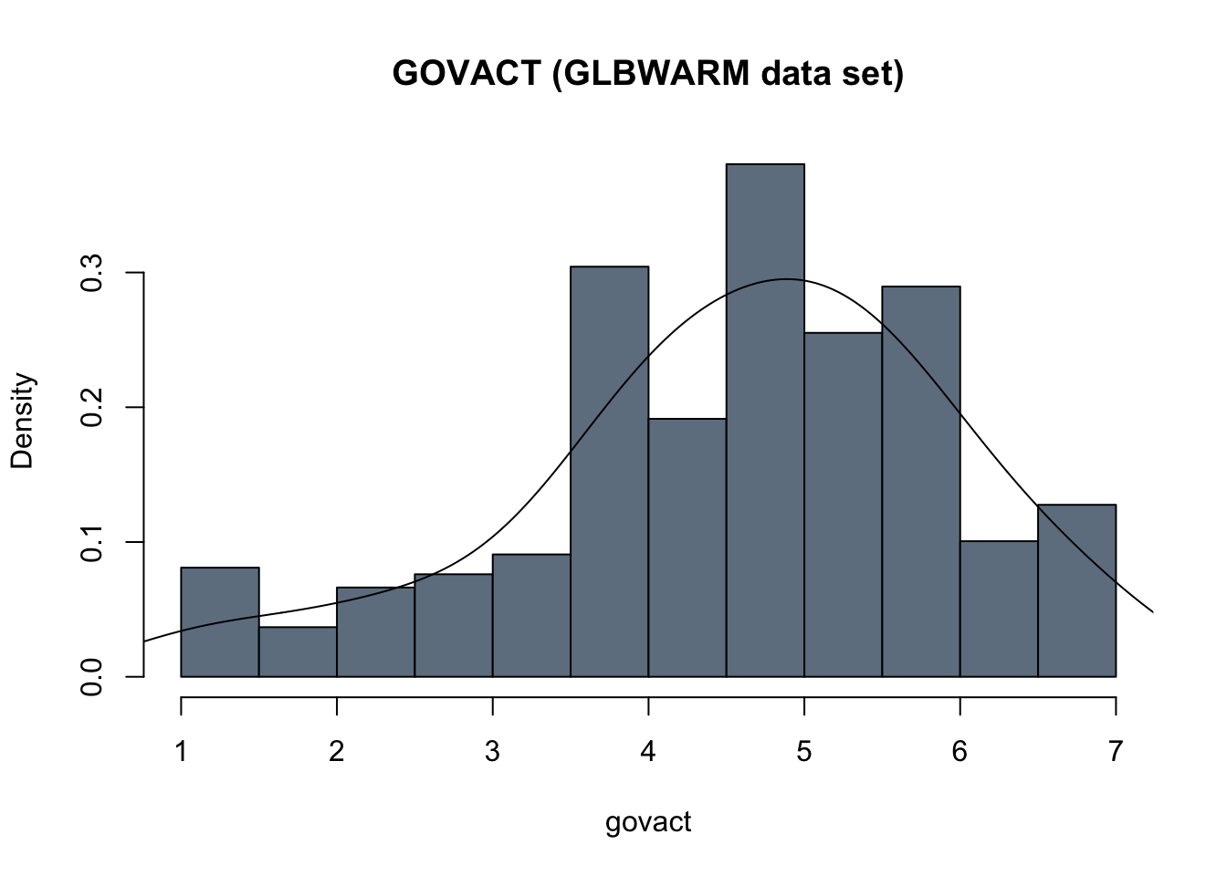
When dealing with continuous variables, may can add a line to overlay a density curve on the histogram, to approximate the shape of the distribution.
hist(glbwarm$govact, probability = TRUE,
     main = "GOVACT (GLBWARM data set)", xlab = "govact",
     col = "slategrey")

# this is to add a line of the "density"
# the argument "lwd" sets the width of the line
lines(density(glbwarm$govact),
      col = "steelblue1",
      lwd = 2)

# this is to add a more smoothed (simpler and more aproximated) density curve
# the argument "lty" sets the type of line
lines(density(glbwarm$govact, adjust = 2),
      col = "lightblue",
      lwd = 3,
      lty = "dotted")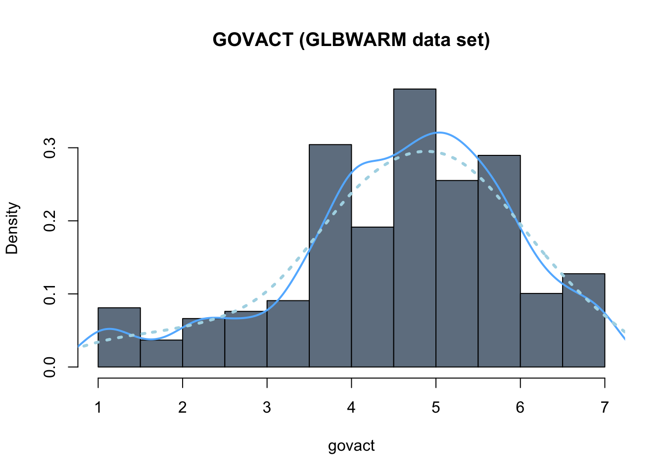
Bar plots
Histograms and box plots are used to represent the distribution of numerical variables, such as continuous and discrete variables. For categorical variables, a bar graph is used instead.
For instance, a histogram of the dichotomous categorical variable sex is not appropriate. It only takes on the values 0 and 1, but they are not numbers (0 = male, 1 = female) and there is nothing in between them (e.g., 0, 0.1, 0.2, …, 1).
hist(glbwarm$sex,
     main = "SEX (categorical dichotomous variable)",
     xlab = "sex")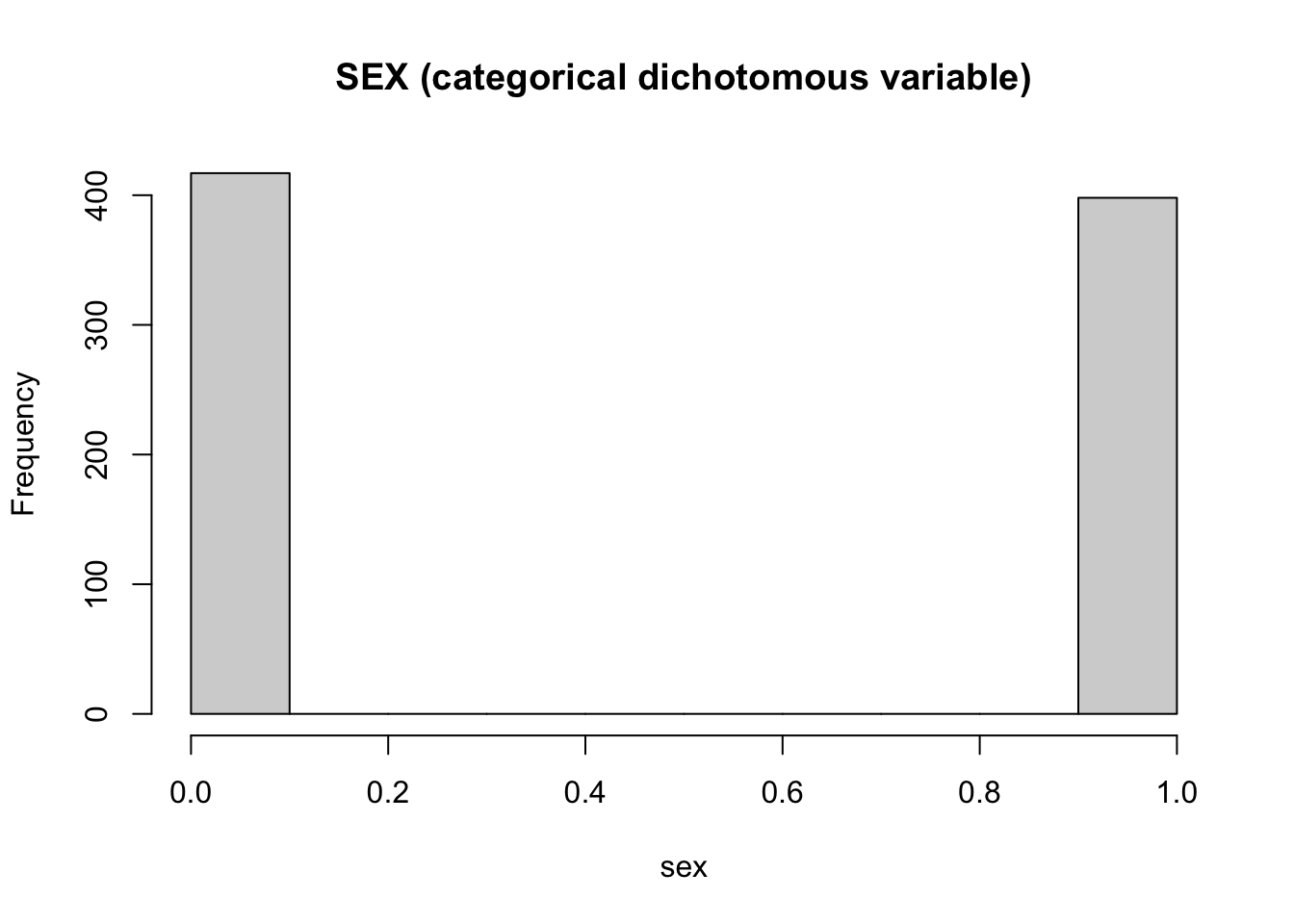
The appropriate way to represent the frequency distribution of categorical variables is with a bar chart (or bar plot). The corresponding R function is barplot.
It takes as an argument a table with the frequency for each modality of the category (i.e., a table with the number of males and females in the sample). The function table returns the frequency of the variable.
table(glbwarm$sex)
  0   1
417 398
This function can be used as the main argument of the function barplot:
barplot(table(glbwarm$sex),
        main = "Observations by SEX",
        xlab = "0 = Male 1 = Female")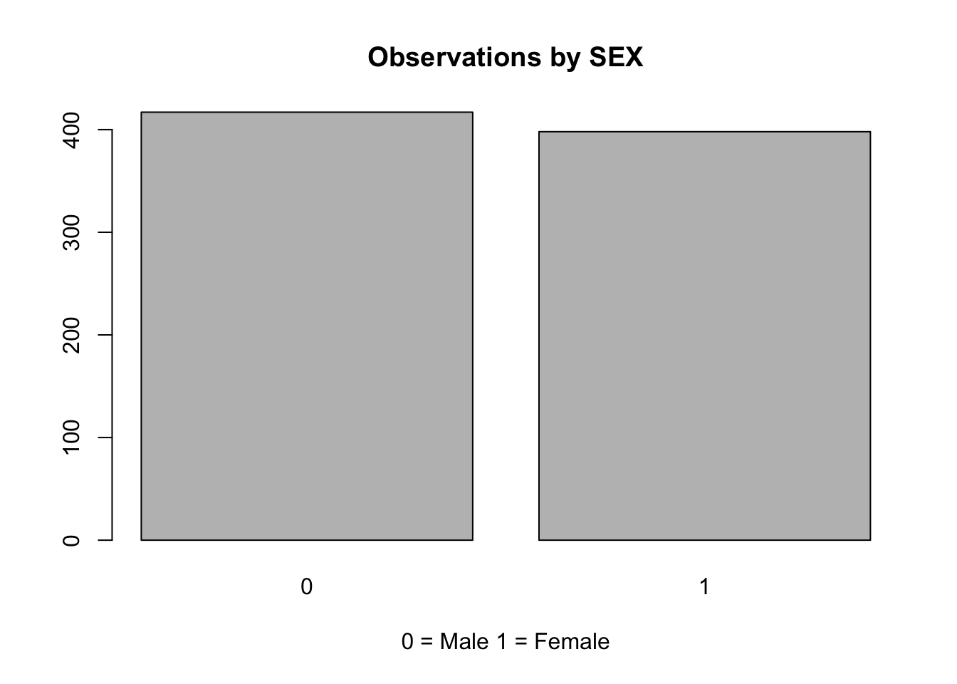
Measures of Spread
Measures of spread describe how similar or varied the set of observed values are for a particular variable. Measures of spread include the range, quartiles, and the interquartile range, as well as the variance and standard deviation.
For example, the interquartile range is the difference between the third and first quartiles and is represented by the size of the “box” in a boxplot.
boxplot(glbwarm$age)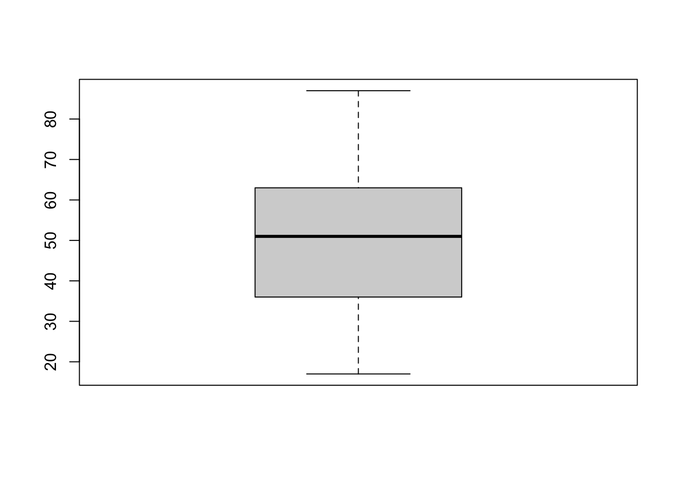
Even more relevant are the variance and standard deviation.
Variance
Variance (represented as \(s^2\) when computed on a sample, as in this case) is a measure of dispersion that quantifies how spread the values of a variable are from the mean (the average value of the variable). In other words, variance measures how much the values of a variable vary.
The formula for variance is:
\[s^2 = \frac{\sum_{i=1}^{n} (x_i-\bar x)^2}{n-1}\]
Capital sigma \(\sum\) is the summation symbol, \((x_i-\bar x)\) is the deviation (i.e., the difference) of each value \(i\) of \(X\) from the mean of \(X\) (\(\bar x\), the mean or average of the variables), and \(n\) is the sample size. In R:
var(glbwarm$age)[1] 266.6937Standard Deviation
The standard deviation (represented as \(s\) when computed on a sample) is the square root of the variance and has the same unit as the variable itself. It is a related, and more commonly used, measure of dispersion. A low standard deviation indicates that the values of a variable tend to be close to its average, while a high standard deviation indicates that the values are spread out over a wider range.
\[s = \sqrt \frac{\sum (x_i-\bar x)^2}{n-1}\]
In R:
sd(glbwarm$age)[1] 16.33076Standardization and z-scores
Besides measuring the spread of a variable, standard deviation is used for standardizing variables.
Standardization is a procedure that transforms the original data (“raw data”) in the so-called z-scores. Z-scores are are values expressed in standardized units by using the average and the standard deviation:
\[Z = \frac{x_i - \bar x}{s}\]
A way to think about standardization, is considering it as the interpretation of values relatively to their own distribution.
The average of a standardized variable is always zero, below-average values are negative and above-average values are positive.
In R, standardization is provided by the function scale.
zscores_age <- scale(glbwarm$age)hist(zscores_age)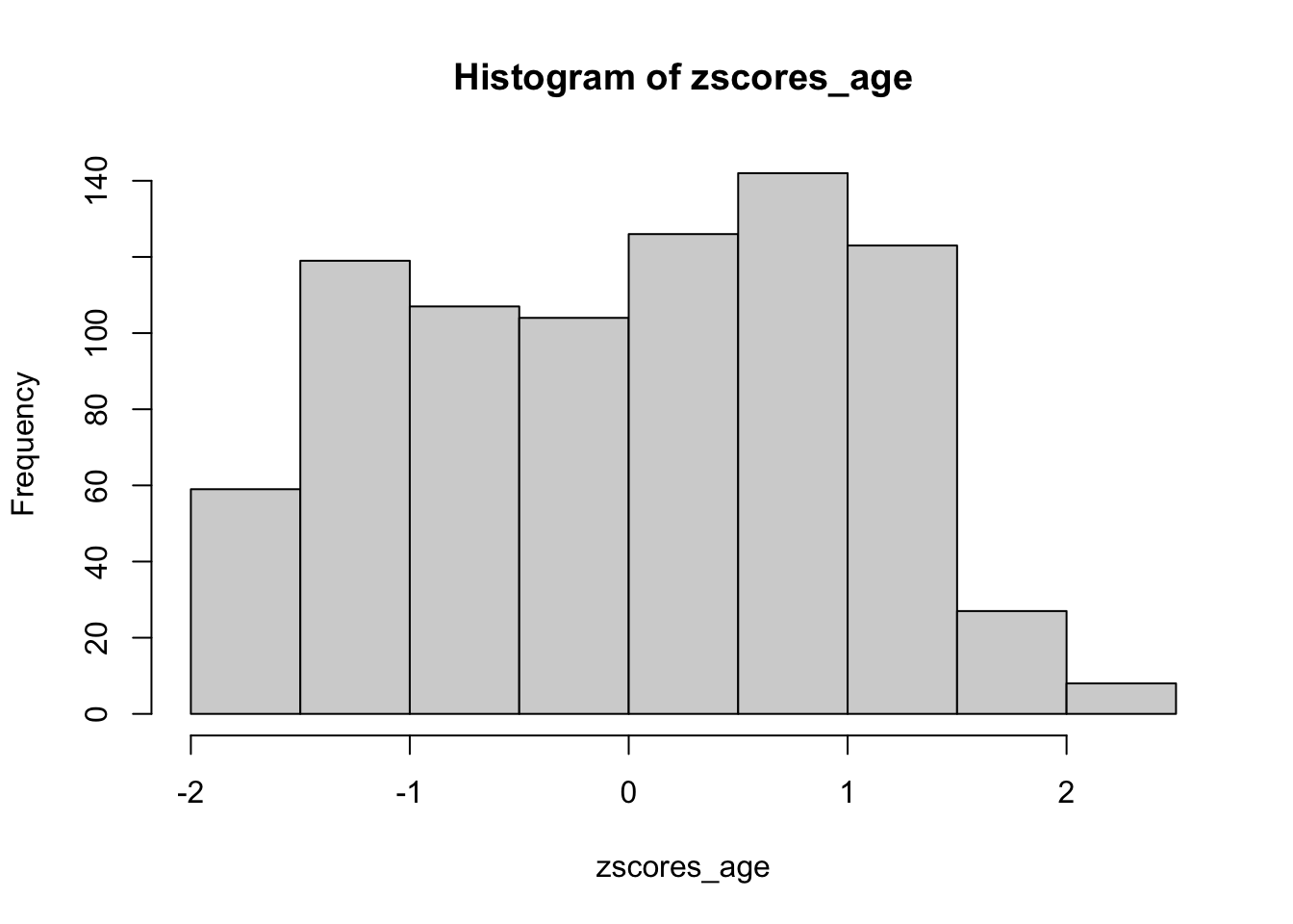
A classic example of the utility of z-scores typically goes like this. Suppose two sections of a statistics course are being taught. John is a student in section A and Mary is a student in section B. On the final exam for the course, John receives a raw score of 80 out of 100 (i.e., 80%). Mary, on the other hand, earns a score of 70 out of 100 (i.e., 70%).
At first glance, it may appear that John was more successful on his final exam. However, scores, considered absolutely, do not allow us a comparison of each student’s score relative to their class distributions. For instance, if the mean in John’s class was equal to 85% with a standard deviation of 2, John’s z-score is:
\[Z = \frac{x_i - \bar x}{\sigma} = \frac{80 - 85}{2} = -2.5\]
Suppose that in Mary’s class, the mean was equal to 65% also with a standard deviation of 2. Mary’s zscore is thus:
\[Z = \frac{x_i - \bar x}{\sigma} = \frac{70 - 65}{2} = 2.5\]
As we can see, relative to their particular distributions, Mary greatly outperformed John.
Z-scores are often used with reference to the standard normal distribution. In this case, 68%, 95%, and 99.7% of the values lie within one, two, and three standard deviations of the mean, respectively. It is considered statistically unlikely that a value is 2 standard deviations either side of the mean. We’ll encounter again the normal distribution and the 2 standard deviation threshold when we’ll take statistical inference into consideration.
Correlation and prediction
In the first section we used statistical measures and charts to describe variables. In this section we’ll learn to assess the relationships between two variables.
At the end of this unit you will understand the Pearson’s correlation coefficient and know the R functions to calculate and create the related statistical plots (scatter plot).
Correlation
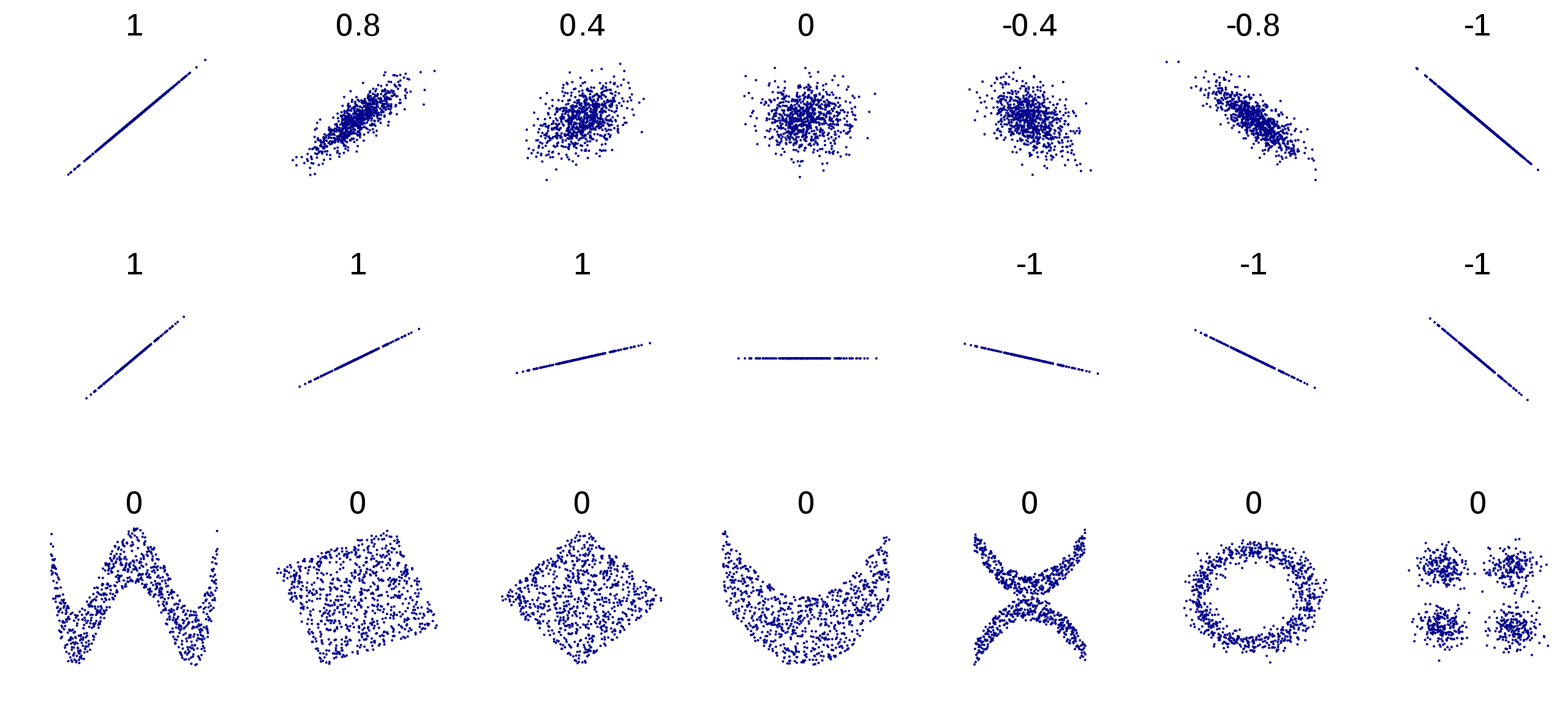
Correlation is a statistical relationship, whether causal or not, between two variables.
Two variables \(X\) and \(Y\) are said to be correlated when they show a systematic association, such that knowing the values of one variable enables the prediction of the values of the other.
Correlation analysis permits the identification of this relationship and the quantification of its strength.
Pearson’s correlation coefficient (Pearson’s R)
The Pearson product-moment correlation, also known as Pearson’s r, is an important measure of correlation. It is also the foundation of most of the linear regression methods discussed in this course. Indeed, it can be used to quantify the linear association (or relationship) between two quantitative variables, a quantitative and a dichotomous variable, as well as between two dichotomous variables.
In a linear association, the direction and rate of change in one variable are constant with respect to changes in the other variable. For example, in a perfect linear association between two variables \(X\) and \(Y\), an increase of 1 point in \(X\) corresponds to an increase of 1 point in \(Y\). A linear relationship describes a straight-line relationship between two variables.
A linear relationship describes a straight-line relationship between two variables.
Pearson’s r and covariance
Pearson’s r is based on the formalization of the idea of calculating the ratio between the degree to which \(X\) and \(Y\) vary together, and the degree to which \(X\) and \(Y\) vary separately, in order to find how much “co-variation” they share.
\[r = \frac{degree-to-which-X-and-Y-vary-together}{degree-to-which-X-and-Y-vary-separately}\]
The idea of co-variation is mathematically expressed by covariance (\(cov\)), which is at the heart of virtually all statistical methods. The Pearson’s \(r\) is a standardized measure of covariance.
Covariance is based on variance (\(s^2\)):
\[s^2 = \frac{\sum_{i=1}^{n} (x_i-\bar x)^2}{n-1}\]
More precisely, covariance is a measure of the joint variability of two variables, and is calculated as the product of the variance of the variables:
\[ cov = \frac{\sum_{i=1}^{n} (x_i-\bar x) (y_i-\bar y)}{n-1}\]
The covariance can be positive, negative, or equal to zero, and gives a measure of the linear correlation between variables.
The reason we calculate covariance in this way is that it captures both the direction and strength of the relationship between the two variables. A positive covariance indicates that the two variables tend to move together (i.e., co-vary) in the same direction, while a negative covariance indicates that they tend to move in opposite directions. The magnitude of the covariance indicates the strength of the relationship, with larger values indicating stronger relationships.
set.seed(321)
x <- sample.int(n = 10, size = 5, replace = TRUE)
y <- sample.int(n = 10, size = 5, replace = TRUE)

df <- data.frame(x = x,
                 y = y,
                 x_mean = mean(x),
                 y_mean = mean(y),
                 x_diff = x - mean(x),
                 y_diff = y - mean(y))

df$x_diff_y_diff <- df$x_diff * df$y_diff

df
x y x_mean y_mean x_diff y_diff x_diff_y_diff
1 6 1 7 4.4 -1 -3.4 3.4
2 2 4 7 4.4 -5 -0.4 2.0
3 9 9 7 4.4 2 4.6 9.2
4 8 2 7 4.4 1 -2.4 -2.4
5 10 6 7 4.4 3 1.6 4.8So, why do we need Pearson’s r? Because covariance is a measure that depends on the unit of measurement of the variables, while it is preferable to have a standard measure, meaningful independently of each specific data set.
Standardization of covariance is obtained by dividing the covariance \(cov\) by the product of the standard deviations of the variables \(X\) and \(Y\). This product represents the total amount of variation possible.
Thanks to the denominator, which represents the total amount of variation possible for the specific couple of variables, \(r\) is always constrained between 1 and -1 for any variable expressed in any unit of measure. The extent to which the co-variation \(cov_{XY}\) accounts for all of the possible variation (\(SD_XSD_Y\)) is the extent to which \(r\) approximates \(|1|\) (negative -1, or positive +1).
\[ r = \frac{cov_{XY}}{SD_XSD_Y}\]
In R, the correlation coefficient can be computed with the function cor. For example:
cor(glbwarm$govact, glbwarm$negemot)[1] 0.5777458The function cor.test is more complete, as it includes the statistical significance of the correlation.
cor.test(glbwarm$govact, glbwarm$negemot)
    Pearson's product-moment correlation

data:  glbwarm$govact and glbwarm$negemot
t = 20.183, df = 813, p-value < 2.2e-16
alternative hypothesis: true correlation is not equal to 0
95 percent confidence interval:
 0.5301050 0.6217505
sample estimates:
      cor
0.5777458
Based on this output, we can write: a Pearson correlation coefficient was computed to assess the linear relationship between support for government action and negative emotions. We found a moderate positive correlation between the variables, \(r(813) = .58, p < 0.001\).
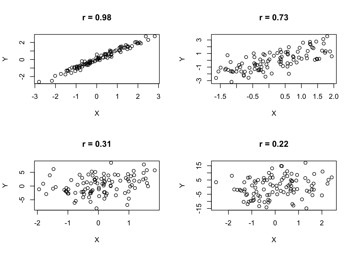
Pearson’s r interpretation
Pearson’s correlation coefficient can be interpreted as follows:
The sign (+/-) corresponds to the direction of the association between X and Y:
- positive linear association (+): the higher X, the higher Y;
- negative linear association (-): the higher X, the lower Y.
\(r\) is close to zero when the association is null or nonlinear
The closer \(r\) is to \(|1|\) (+1 or -1), the stronger the linear association.
There are different rule of thumbs for the interpretation of the Pearson’s correlation. For example, Mike Allen (2017), The SAGE Encyclopedia of Communication Research Methods (p. 269) suggests the following:
- 0.00-0.19 Negligible correlation
- 0.20-0.39 Weak correlation
- 0.40-0.59 Fair correlation
- 0.60-0.79 Moderate correlation
- 0.80-1.00 Strong correlation
This looks a very conservative interpretations. Other guidelines suggest the following interpretation:
0.10-0.30 Small
0.30-0.50 Medium
0.50-1.00 Large
Moreover, this guidelines cannot be applied rigidly:
For example, even though the correlation between taking aspirin and preventing a heart attack is only \(r = .03\) in magnitude (see Rosenthal, 1991, p. 136)—small by most statistical standards—this value may be socially important and may nonetheless influence social policy (Hemphill, J. F. (2003). Interpreting the magnitudes of correlation coefficients)
Scatter plots
A scatter plot is a common method for visually exploring and representing the correlation between two variables.
A scatter plot is a type of plot or mathematical diagram that uses Cartesian coordinates to display values for typically two variables for a set of data. If the points are coded (color/shape/size), an additional variable can be displayed. The data are displayed as a collection of points, with the value of one variable determining the position on the horizontal axis and the value of the other variable determining the position on the vertical axis.
To create a scatter plot in R, you can use the function plot. It takes two arguments: x (the first variable) and y (the second variable). The argument pch changes the shape of the points; see more details here.
plot(glbwarm$govact, glbwarm$posemot,
     pch = 20,
     xlab = "govact",
     ylab = "posemot")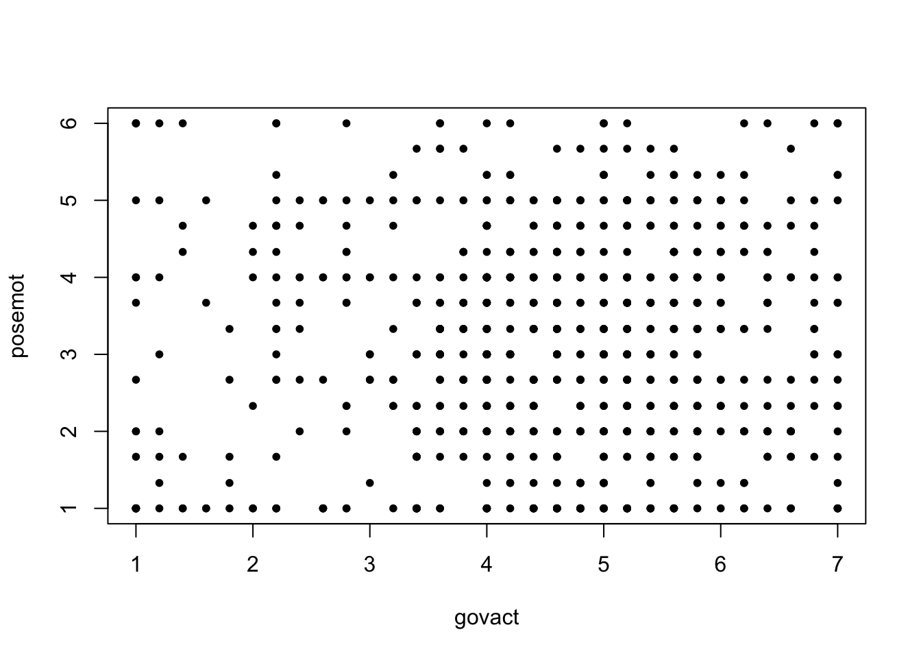
The scatter plot shows the direction of the association.
X <- rnorm(100) # simulating data
Yp <- X + rnorm(100, sd=0.5)
Yn <- -Yppar(mfrow=c(1,2))
plot(X, Yp, main = "Positive Association")
plot(X, Yn, main = "Negative Association")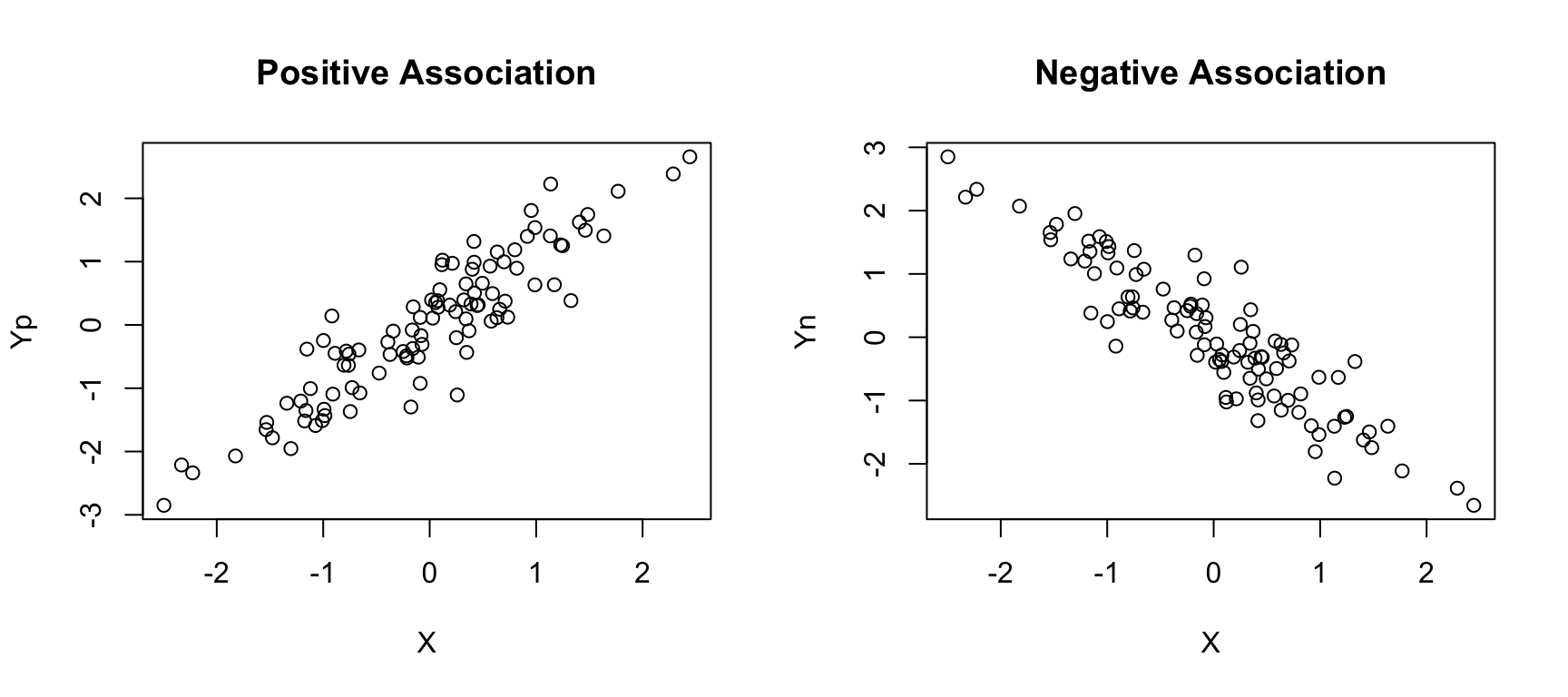
Predictions
When there is a correlation between \(X\) and \(Y\), using \(X_j\) to estimate \(Y_j\) produces estimates that are more accurate than if one were to merely estimate \(Y_j = \bar Y\) (the average value of \(Y\)) for every case in the data.
Given a variable \(X\) and \(Y\) of a data set of size n, the subscripts \(_j\) in \(X_j\) and $Y_j$, indicates the \(j\) case. It can be any one of the \(n\) cases, but the same for both the \(X\) and \(Y\) variables. In other words, it indicates the measures of the case \(j\) on the variables \(X\) and \(Y\).
Pearson’s r provides an estimate as to how many standard deviations (Z) from the sample mean on \(Y\) a case is, given how many standard deviations from the sample mean the case is on \(X\). More formally:
\[\hat Z_{Y_j} = r_{XY}Z_{X_j}\]
where \(\hat Z_{Y_j}\) is the estimated value of \(Z_{Y_j}\).
- For instance, a person who is one-half of a standard deviation above the mean (\(Z_X = 0.5\)) in negative emotions, is estimated to be \(\hat{Z} = 0.578(0.5) = 0.289\) standard deviations from the mean in his or her support for government action.
- The sign of \(\hat{Z_Y}\) is positive, meaning that this person is estimated to be above the sample mean (i.e., more supportive than average).
- Similarly, someone who is two standard deviations below the mean (\(Z_X = −2\)) in negative emotions is estimated to be \(Z_Y = 0.578(−2) = −1.156\) standard deviations from the mean in support for government action.
- In this case, \(\hat{Z_Y}\) is negative, meaning that such a person is estimated to be below the sample mean in support for government action (i.e., less supportive than average).
Estimates of \(Y\) from \(X\) are expectations extracted from what is known about the association between \(X\) and \(Y\). In statistics, expectations are never perfectly met, but we have a numerical means of gauging how close are to reality.
In our case, that gauge is the size of Pearson’s r. The closer it is to \(+/- 1\), the more consistent those expectations are with the reality of the data.
Readings and exercises
- Review the content of the class
- Read chapter 2, pp. 29-34
Notes on the GLBWARM data set and exercises
GLBWARM is a data set collected from 815 residents of the United States (417 female, 398 male) who expressed a willingness to participate in online surveys in exchange for various incentives. The sampling procedure was designed such that the respondents roughly represent the U.S. population.
The data set contains a variable constructed from how each participant responded to five questions about the extent to which he or she supports various policies or actions by the U.S. government to mitigate the threat of global climate change.
Examples include:
- “How much do you support or oppose increasing government investment for developing alternative energy like biofuels, wind, or solar by 25%?”
- “How much do you support or oppose creating a ‘Cap and Trade’ policy that limits greenhouse gases said to cause global warming?”
Response options were scaled from “Strongly opposed” (coded 1) or “Strongly support” (7), with intermediate labels to denote intermediate levels of support. An index of support for government action to reduce climate change was constructed for each person by averaging responses to the five questions (GOVACT in the data file).
The data set also contains a variable quantifying participants’ negative emotional responses to the prospect of climate change. This variable was constructed using participants’ responses to a question that asked them to indicate how frequently they feel each of three emotions when thinking about global warming: “worried,” “alarmed,” and “concerned.” Response options included “not at all,” “slightly,” “a little bit,” “some,” “a fair amount,” and “a great deal.” These responses were numerically coded 1 to 6, respectively, and each participant’s responses were averaged across all three emotions to produce a measure of negative emotions about climate change (NEGEMOT in the data file). This variable is scaled such that higher scores reflect feeling stronger negative emotions.
Exercise 1
Display the correlation between the variables
negemotandgovactusing a scatter plot.Based on the plot, can you tell if there is a correlation between the two variables?
Is there a strong correlation between these variables?
Use the function
corto calculate the correlation between the variablesnegemotandgovactin theglbwarmdata set.Based on the Pearson’s r coefficient, is there a strong correlation between these variables?
Exercise 2
Download theJoint EVS/WVS 2017-2022 Dataset ZA7505_v4-0-0.dta and save it in your data project directory.
Use the following tidyverse code to create a data set.
# install the packages if necessary
library(haven)
library(tidyverse)
library(janitor)
Attaching package: 'janitor'The following objects are masked from 'package:stats':
chisq.test, fisher.testZA7505_v4_0_0 <- read_dta("data/ZA7505_v4-0-0.dta")
# tidyverse data manipulation pipeline
df <- ZA7505_v4_0_0 %>%
# select a few variables related to religion and tolerance for "non-traditional" behaviors
select(year, cntry_AN, X003, X003R, A006, A065, E033, A124_09, D081, F120, F121, F122, C001_01) %>%
# rename the selected columns
rename("Age" = X003,
"Age recoded" = X003R,
"Important in life: Religion" = A006,
"Member: Belong to religious organization" = A065,
"Dont like as neighbours: homosexuals" = A124_09,
"Homosexual couples are as good parents as other couples" = D081,
"Jobs scarce: Men should have more right to a job than women" = C001_01,
"Self positioning in political scale" = E033,
"Justifiable: Abortion" = F120,
"Justifiable: Divorce" = F121,
"Justifiable: Euthanasia" = F122) %>%
# keep Austrian data only
filter(cntry_AN == "AT") %>%
# clean the column names
janitor::clean_names()
df$important_in_life_religion<labelled<double>[1644]>: Important in life: Religion
[1] 1 4 3 3 3 3 4 3 2 3 4 2 3 2 3 2 2 1 1 3 1 4 2 2
[25] 2 4 2 4 3 2 4 2 2 3 2 2 2 2 3 3 2 1 2 2 2 2 2 4
[49] 3 3 4 2 3 3 2 1 4 1 4 3 4 3 3 3 4 1 1 4 2 3 4 2
[73] 2 4 2 4 4 3 3 3 2 3 3 3 2 4 3 3 2 4 2 1 1 4 2 1
[97] 4 1 1 4 2 3 3 4 2 4 3 4 4 2 1 4 2 2 1 2 2 3 4 3
[121] 3 4 2 2 4 3 1 2 3 3 4 4 4 3 2 3 3 4 2 3 2 4 2 4
[145] 1 1 2 2 2 2 1 2 3 2 2 2 1 3 4 2 3 3 3 4 2 3 3 4
[169] 2 3 4 3 4 2 2 3 3 2 4 2 1 3 1 2 3 4 3 2 1 1 2 3
[193] 3 1 4 3 1 2 2 3 1 4 3 2 2 4 3 2 4 2 4 4 1 3 1 4
[217] 3 4 2 3 1 1 3 3 3 3 2 1 2 1 3 3 3 4 1 3 2 3 1 4
[241] 4 4 2 2 2 3 3 1 4 2 4 4 4 2 3 2 4 2 3 4 1 2 2 2
[265] 4 3 2 4 3 2 1 4 3 2 3 1 3 3 3 2 3 2 2 4 3 2 3 1
[289] 3 2 4 3 4 4 2 2 4 2 3 4 4 1 3 3 4 2 2 4 3 2 3 4
[313] 1 4 4 3 3 3 3 2 4 3 1 3 2 2 1 1 2 2 2 3 2 4 3 2
[337] 3 3 3 3 4 3 3 1 3 2 1 1 2 1 4 3 -2 3 1 2 3 4 3 1
[361] 1 3 2 3 1 2 1 2 4 1 2 2 3 2 2 2 2 2 4 2 4 2 4 2
[385] 4 1 4 4 3 4 3 2 4 2 3 2 3 1 4 4 3 4 1 3 4 4 2 4
[409] 4 1 2 3 4 3 3 1 2 1 3 3 4 3 4 3 2 4 4 4 2 3 1 2
[433] 2 4 4 1 2 1 -2 2 1 4 2 2 1 2 3 1 3 4 3 3 4 3 4 1
[457] 3 1 3 1 2 4 3 2 1 3 4 3 3 2 2 1 4 3 2 4 2 -2 4 3
[481] 3 4 3 2 2 4 2 1 1 2 2 4 2 3 3 4 1 1 3 2 3 2 3 1
[505] 3 3 3 1 3 3 2 1 2 2 3 4 3 3 4 4 3 2 2 2 4 4 2 4
[529] 1 2 4 4 3 3 3 2 2 4 2 2 3 2 4 3 2 4 2 1 3 3 3 4
[553] 2 3 1 4 3 4 3 3 4 1 2 3 3 3 3 3 4 1 4 3 1 2 3 2
[577] 2 3 2 2 3 2 3 3 2 4 4 1 3 4 3 3 1 2 3 4 2 3 3 4
[601] 1 2 2 4 4 2 1 4 1 2 1 3 2 2 4 2 2 4 2 3 4 3 3 3
[625] 3 3 2 2 2 4 4 3 2 4 4 3 1 3 2 2 2 4 4 4 2 3 2 2
[649] 1 2 3 1 2 4 4 3 3 2 2 2 4 2 2 4 1 1 3 3 3 4 3 4
[673] 3 3 2 2 4 1 1 4 2 4 4 2 2 3 2 4 4 4 2 2 4 4 3 4
[697] 2 4 2 3 2 3 1 2 2 2 1 3 3 3 3 4 2 1 1 3 2 2 3 -1
[721] 3 4 3 1 2 4 1 4 3 2 4 4 3 4 3 3 4 4 2 3 3 4 3 3
[745] 4 3 2 3 2 4 2 1 3 3 3 2 4 2 2 1 2 1 3 2 3 3 4 3
[769] 2 2 2 3 4 1 3 3 4 2 4 2 3 2 3 4 3 3 2 4 2 3 4 3
[793] 4 3 3 3 4 3 3 3 2 4 4 1 4 1 4 3 3 3 2 3 3 3 2 2
[817] 1 3 3 4 3 2 3 4 1 3 3 3 3 3 3 1 2 2 3 2 1 3 2 3
[841] 4 3 2 1 3 2 3 1 2 2 4 4 1 2 2 2 4 3 3 1 2 1 2 3
[865] 3 3 4 1 3 4 4 2 2 2 4 3 3 4 3 2 2 1 4 2 2 2 4 4
[889] 2 3 4 1 4 2 3 3 3 2 1 1 3 -2 4 3 2 2 -2 3 2 3 2 3
[913] 1 2 2 1 2 2 2 2 1 1 1 4 3 4 3 2 2 3 1 2 3 4 3 2
[937] 4 2 1 2 3 3 2 2 1 4 4 4 2 3 3 1 3 3 2 4 3 2 4 2
[961] 1 3 3 3 3 2 2 3 2 3 3 3 3 3 2 3 1 3 3 3 4 3 2 4
[985] 3 4 3 1 2 3 2 1 3 2 3 3 1 -1 2 2 3 3 2 4 4 4 -1 3
[1009] 3 1 2 2 3 2 4 1 3 3 4 2 2 3 2 3 2 2 2 4 2 3 3 1
[1033] 4 2 1 3 4 3 3 3 3 -2 3 1 3 3 4 3 4 4 3 4 3 3 2 3
[1057] 3 2 3 2 1 1 2 2 4 2 3 2 2 3 4 2 4 4 3 3 3 3 3 3
[1081] -1 3 4 3 2 1 4 2 1 3 2 1 -1 4 3 2 1 3 3 2 2 3 2 1
[1105] 4 3 1 1 3 2 2 3 3 3 1 3 2 2 1 3 2 3 2 1 4 2 4 2
[1129] 4 2 2 1 3 3 2 1 2 3 2 1 4 2 2 4 2 4 3 4 2 3 3 3
[1153] 3 4 2 3 2 3 4 3 2 2 1 4 2 3 1 4 -1 2 3 2 2 2 2 2
[1177] 3 3 2 4 4 3 3 3 3 2 3 3 2 1 4 3 2 2 4 4 3 1 1 1
[1201] 3 3 4 2 2 4 3 4 3 3 2 1 4 3 4 1 3 3 3 2 4 2 4 4
[1225] 2 1 4 2 3 3 1 1 2 4 2 1 1 3 2 4 4 3 3 4 3 4 2 3
[1249] 3 4 2 1 3 1 3 3 3 3 2 3 2 3 2 3 3 2 3 2 4 3 3 3
[1273] 1 4 3 2 4 2 2 2 3 3 2 4 4 4 3 2 4 3 3 1 3 3 2 3
[1297] 4 4 2 2 4 2 3 3 3 2 2 2 1 1 3 1 4 3 4 3 4 4 3 1
[1321] 1 2 1 1 2 4 2 2 3 4 4 2 3 3 2 3 3 2 -2 3 2 3 3 2
[1345] 3 4 4 4 3 1 2 2 2 2 4 4 2 3 2 4 3 2 4 3 4 4 2 2
[1369] 2 4 1 4 3 2 1 3 2 2 3 2 4 1 2 1 4 3 3 4 1 3 4 4
[1393] 3 3 1 2 4 2 3 4 2 3 1 2 1 4 4 3 1 4 3 2 4 4 3 3
[1417] 4 2 1 4 1 1 1 4 4 2 3 2 2 2 3 3 2 3 2 2 3 4 2 3
[1441] 2 3 2 2 4 3 4 2 3 2 4 4 3 3 2 1 2 4 3 -1 2 2 3 4
[1465] 2 3 3 1 2 4 2 2 4 4 4 1 2 2 4 3 1 4 1 4 2 1 4 4
[1489] 2 2 2 4 3 3 4 4 3 1 3 2 4 4 2 2 1 3 4 3 2 3 3 2
[1513] 3 2 4 1 3 1 1 3 1 4 3 3 3 2 2 2 4 3 3 4 4 4 3 2
[1537] 2 3 3 2 2 4 3 2 2 2 3 3 3 3 1 2 2 4 2 2 2 2 3 4
[1561] 4 1 2 3 3 3 3 2 3 1 3 3 3 2 3 1 3 3 3 1 4 4 2 2
[1585] 2 1 2 4 3 -1 2 4 4 2 2 4 3 1 2 1 1 1 1 2 3 3 3 2
[1609] 1 1 3 1 4 3 1 2 1 3 2 4 2 1 3 3 2 3 3 3 2 2 4 2
[1633] 2 4 2 4 1 4 4 2 2 4 2 2
Labels:
value label
-5 Missing: Other
-4 Not asked in survey
-3 Not applicable
-2 No answer
-1 Don´t know
1 Very important
2 Rather important
3 Not very important
4 Not at all importantsummary(df$important_in_life_religion) Min. 1st Qu. Median Mean 3rd Qu. Max.
-2.000 2.000 3.000 2.604 3.000 4.000 df <- df %>%
# keep only positive values
filter(if_all(where(is.numeric), ~ .x >= 0))
summary(df$important_in_life_religion) Min. 1st Qu. Median Mean 3rd Qu. Max.
1.000 2.000 3.000 2.667 3.000 4.000 Choose at least four variables, including one dependent variable and three independent variables, conduct the necessary exploratory analysis, and write a short report in APA style (see here and here).
The analysis and report should include:
a succinct explanation of the hypothesis behind the choice of variables. Specifically, what relationship is assumed between dependent variable and independent variables? Indicate direction (positive or negative correlation) and assumed strength of the relationship.
The sample size.
For each variable, the minimum, the maximum, the mean and standard deviation. Report them in text using APA style and in a table formatted as in this paper (pag. 35).
An histogram and a box plot of the dependent variable.
For each pair of variables (in the case of correlation analysis), report the Pearson’s correlation coefficient measure. Before running the analysis, explain what you are going to measure (as in this paper, pag. 14, second and third sentence of the paragraph), report the correlations using the APA style (see here and here) and include a very brief interpretation of the strength and significance of the coefficients. Also include scatter plots.